


CoffeeCup Software
The software developed by the CoffeeCup Software company is recommended for both the more advanced user and hobbyist
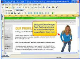
Their software is inexpensive and trial versions are available to test before use. CoffeeCup Software began in an actual coffee shop in 1994 and its first product
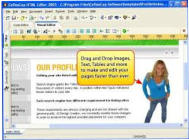
was a simple yet powerful HTML Editor which remains DoveSoft's HTML editor of choice. An interesting feature of the HTML Editor is support for Markdown
which offers a simplified alternative to HTML (hyper text markup language)
CoffeeCup's unique selling point is responsive software as the plethora of mobile machines and web access has caused a shift in the way the web is consumed.
The only way to assure a consistent experience across all these devices is a design that adjusts or ‘responds’ to the available display space. Not by zooming out,
that would make everything unusably small, but by reorganising the content and scaling where appropriate. Indeed responsive design proved to not only be an
exciting, but also the only viable solution. The features of responsive web design (RWD) do NOT include:-
•
Using just a fluid design, that only squishes your content is not responsive,
•
Building a site on a template with (two) fixed predetermined breakpoints, is not responsive,
•
Being unable to adjust or add breakpoints for your specific content needs, is not responsive.

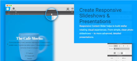
There are many aspects to responsive design and CoffeeCup are dedicated
to bring you the tools you’ll need to master them all. For example, their
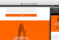
latest product is a Responsive Content Slider as illustrated below. Other
products include flagship Site Designer, CSS Grid Builder, Responsive
Email Designer, Foundation Framer, Bootstrap Builder, Web Form
Builder and Menu Builder.
CoffeeCup are moving full speed ahead into the next projects and
developing solutions that solve responsive design challenges is a serious
and time consuming job. A Responsive WordPress Designer is coming soon
but visit their site for details of all their numerous products.
Responsive web design (RWD) is an approach to web design aimed
at crafting sites to provide an optimal viewing experience—easy
reading and navigation with a minimum of resizing, panning, and
scrolling—across a wide range of devices (from desktop computer
monitors to mobile phones).
Responsive design is different and more tedious than a lot of people
think. Responsive design is NOT making a few tweaks at two arbitrary
screen widths. Responsive wireframing is NOT making wireframes for
one desktop, one tablet, and one mobile screen size.
Responsive design and wireframing is making your design look good,
and assuring your layout and content are usable on big desktop
monitors, television screens, small smart phones.

Site developed using Xara Designer Pro +
© DoveSoft UK 2026


CoffeeCup Software
The software developed by the CoffeeCup Software company is recommended
for both the more advanced user and hobbyist
Their software is inexpensive and trial versions are available to test before use.
CoffeeCup Software began in an actual coffee shop in 1994 and its first product
was a simple yet powerful HTML Editor which remains DoveSoft's HTML editor of
choice. An interesting feature of the HTML Editor is support for Markdown which
offers a simplified alternative to HTML (hyper text markup language)
CoffeeCup's unique selling point is responsive software as the plethora of mobile
machines and web access has caused a shift in the way the web is consumed. The
only way to assure a consistent experience across all these devices is a design
that adjusts or ‘responds’ to the available display space. Not by zooming out, that
would make everything unusably small, but by reorganising the content and
scaling where appropriate. Indeed responsive design proved to not only be an
exciting, but also the only viable solution. The features of responsive web design
(RWD) do NOT include:-
•
Using just a fluid design, that only squishes your content is not responsive,
•
Building a site on a template with (two) fixed predetermined breakpoints, is
not responsive,
•
Being unable to adjust or add breakpoints for your specific content needs, is
not responsive.
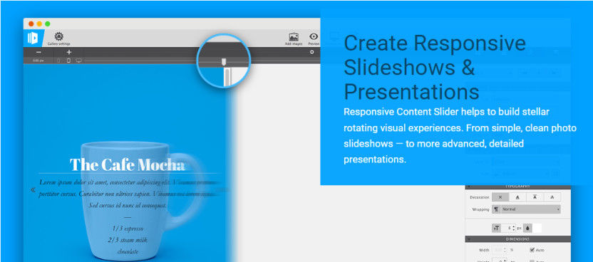
There are many aspects to responsive design and CoffeeCup are dedicated
to bring you the tools you’ll need to master them all. For example, their
latest product is a Responsive Content Slider as illustrated below. Other
products include flagship Site Designer, CSS Grid Builder, Responsive
Email Designer, Foundation Framer, Bootstrap Builder, Web Form
Builder and Menu Builder.
CoffeeCup are moving full speed ahead into the next projects and
developing solutions that solve responsive design challenges is a serious
and time consuming job. A Responsive WordPress Designer is coming soon
but visit their site for details of all their numerous products.
Responsive web design (RWD) is an approach to web design aimed
at crafting sites to provide an optimal viewing experience—easy
reading and navigation with a minimum of resizing, panning, and
scrolling—across a wide range of devices (from desktop computer
monitors to mobile phones).
Responsive design is different and more tedious than a lot of people
think. Responsive design is NOT making a few tweaks at two arbitrary
screen widths. Responsive wireframing is NOT making wireframes for
one desktop, one tablet, and one mobile screen size.
Responsive design and wireframing is making your design look good,
and assuring your layout and content are usable on big desktop
monitors, television screens, small smart phones.